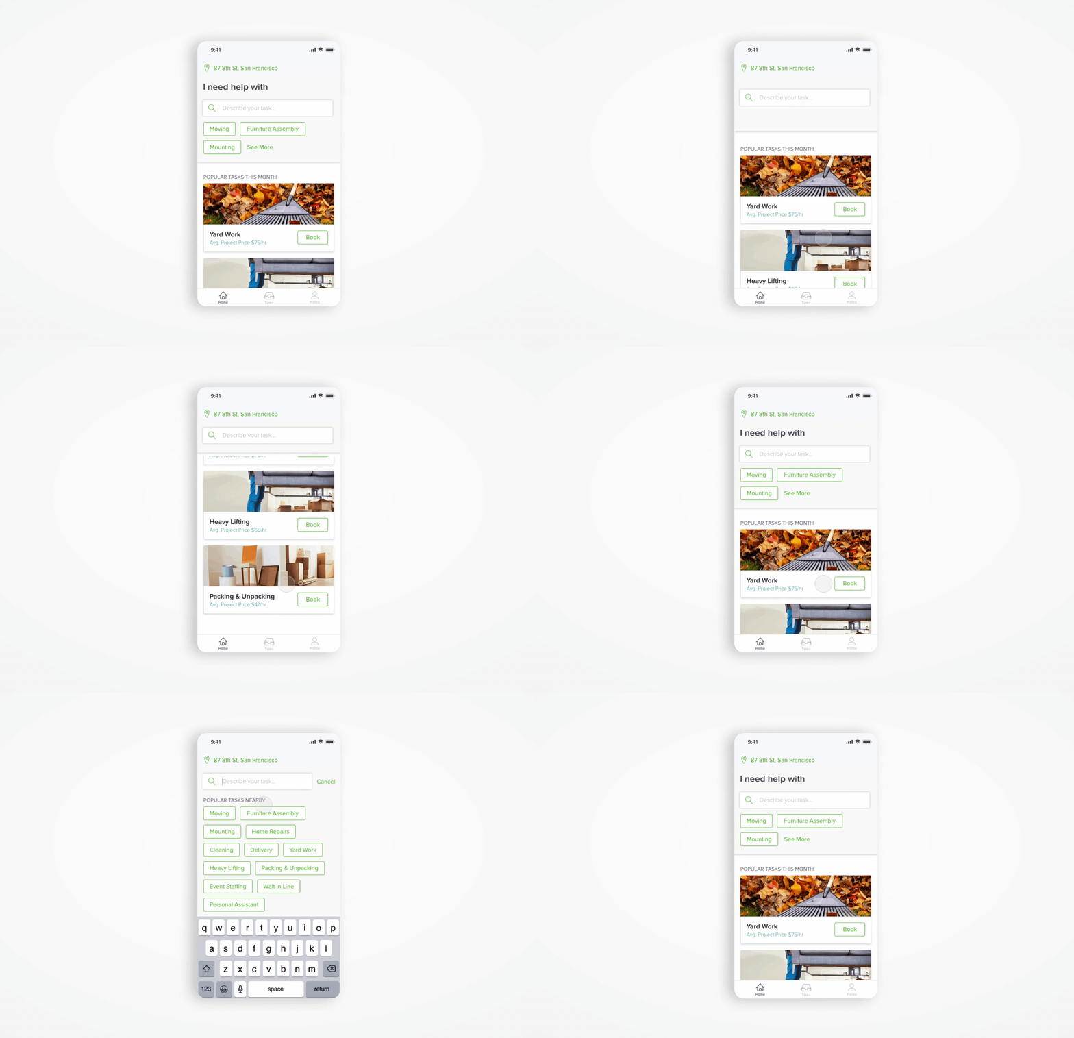
2019 TASKRABBIT (Client)
TaskRabbit app | 2019
Client Storefront Redesign
Role: Senior Product Designer
Cross Functional Team: Product Manager, Data Analyst, Engineers, Marketing and Content Writer
Platform: iOS and Android (react native)
CONTEXT
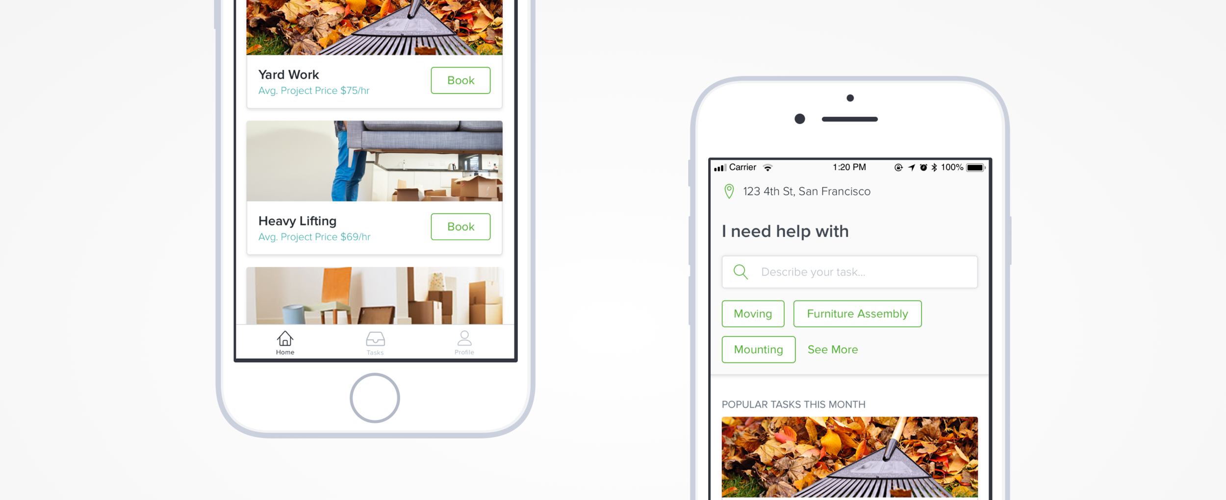
The TaskRabbit Client mobile app had been using the same storefront layout for many years. After a recent app rewrite with major bugs fixed, it was time to re-think how we help a user book a task.
TaskRabbit (iOS), TaskRabbit (Android)
STRATEGY
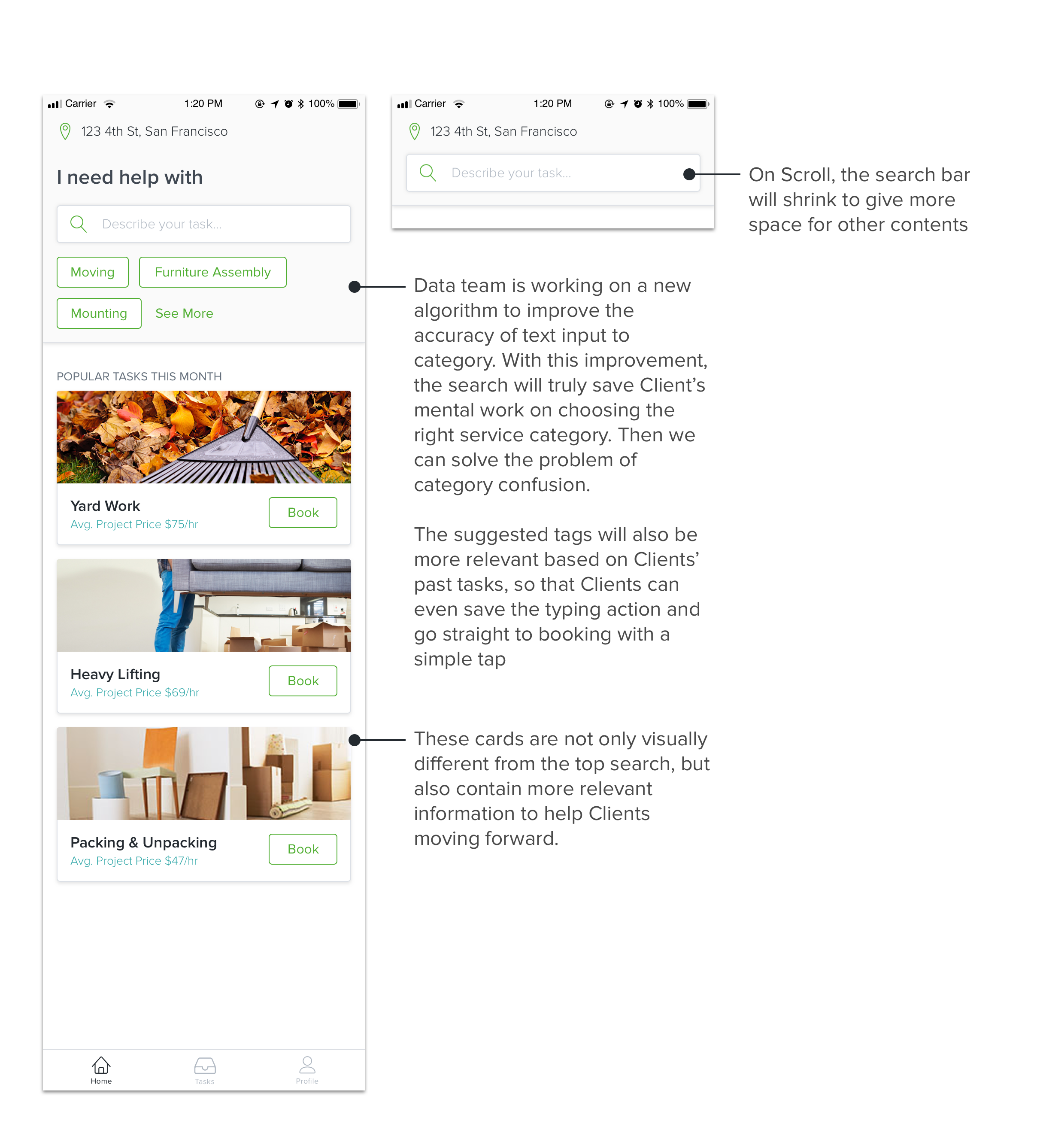
We want to run different bold experiments with the content on the storefront, so we need a flexible and sophisticated structure to allow all different kinds of experiment. This structure will also allow us to offer more customized content for our Client to have a more personalized experience.
PROBLEMS
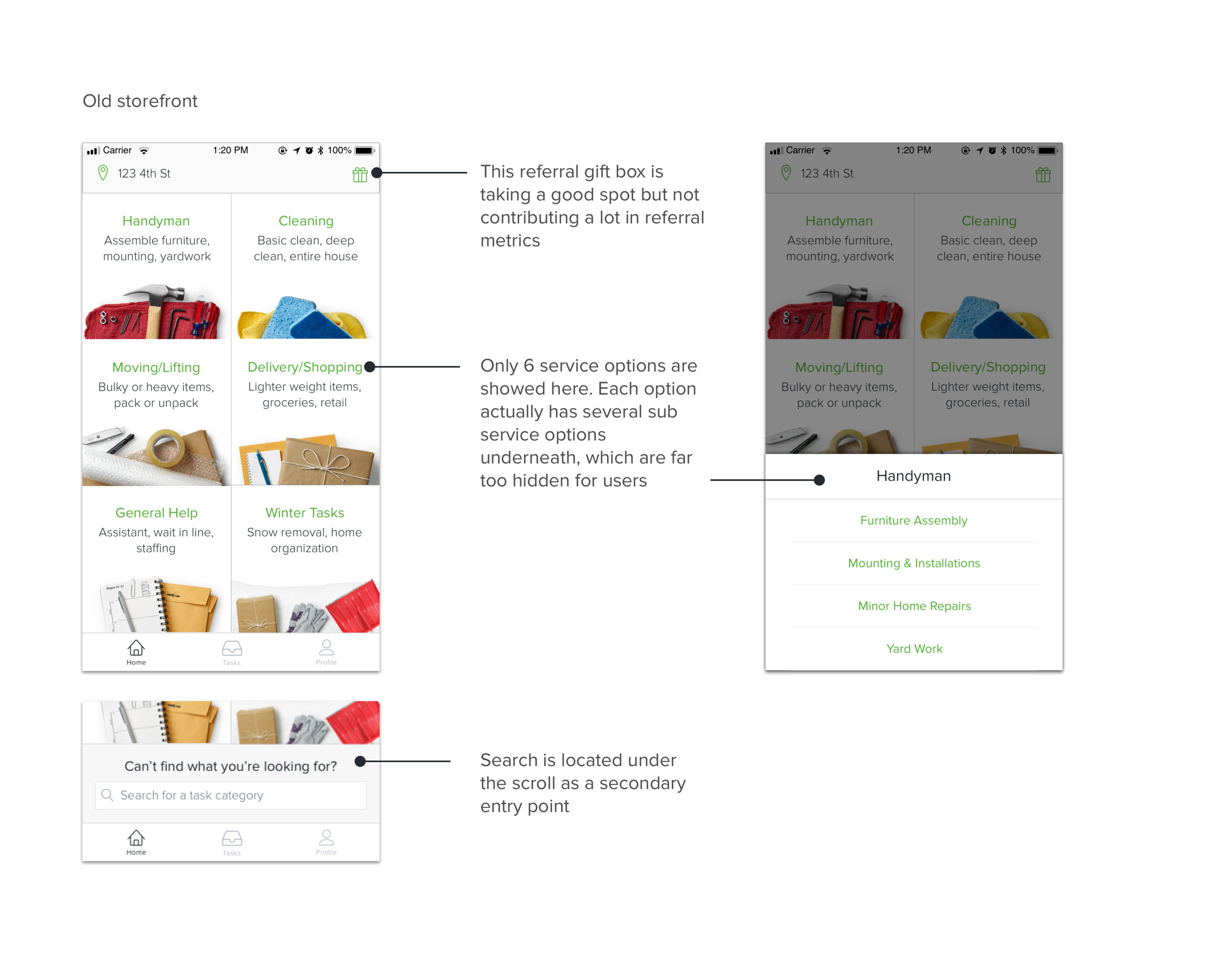
Most new Clients have vague to no understanding of what TaskRabbit can provide
Most new Clients don’t know what service category they should choose (Category Confusion)
GOAL
How might we create a customizable and content rich storefront for Clients to navigate into the right booking experience.
EXPLORATIONS
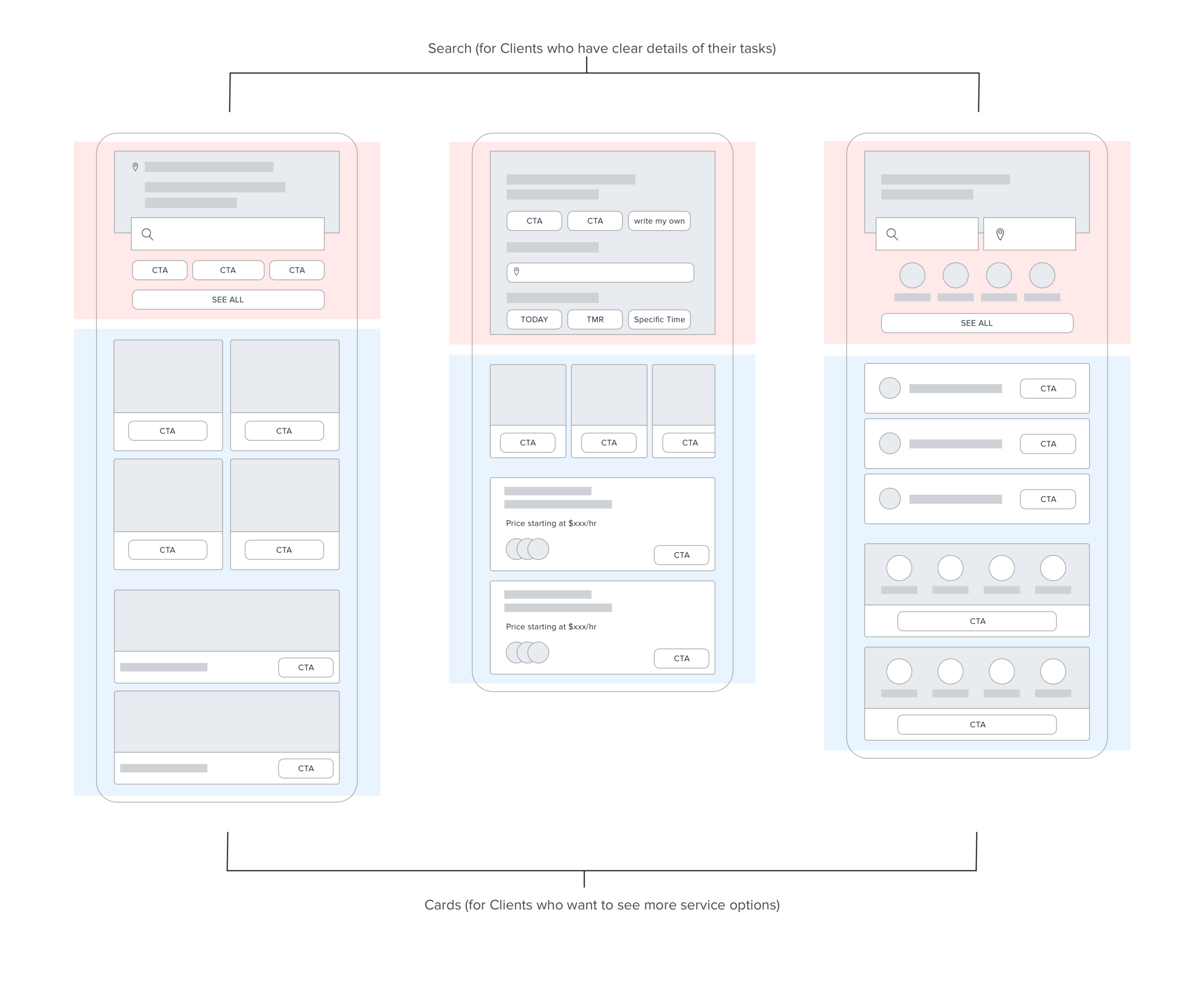
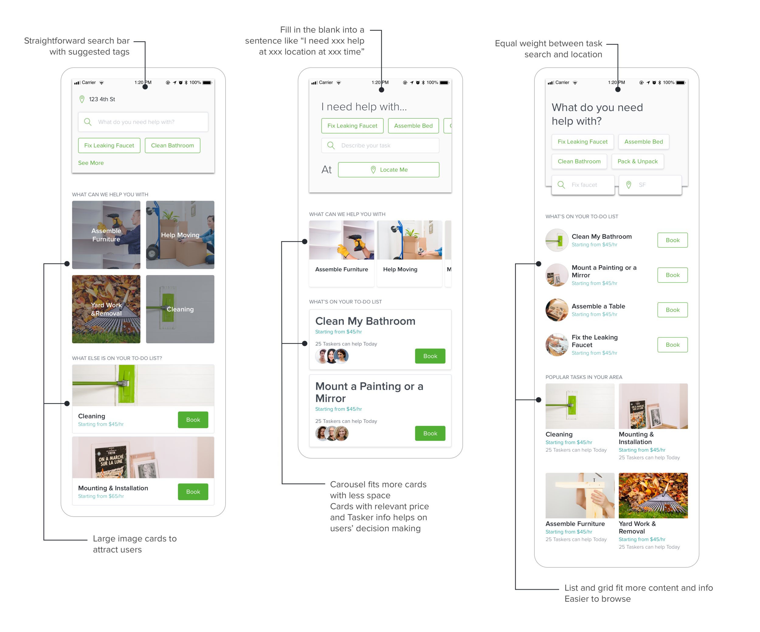
Different Clients have different preferred ways to looking for what they need on our platform, therefore it’s necessary to offer various entry ways. Here are some ideas for different types of entry ways.
FINAL DESIGN
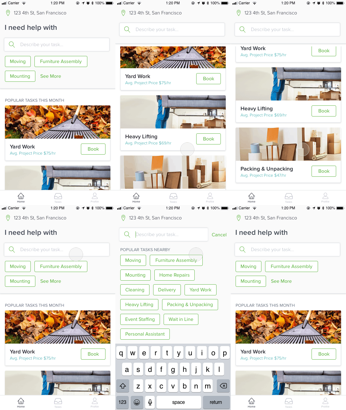
USABILITY TESTING
We conducted a quantitative usability survey and several qualitative usability in-person interviews with this Design Solution. We noticed several patterns:
1. Most Clients can not connect their problem with the category that’s offered.
I will always go to search because I’m not sure what should I pick for my need.
2. Relevant information helps Clients moving forward in the booking funnel with more confidence.
I like [it is] showing how much it might cost for me and who can help me right away.
NEXT STEPS
Build search bar and A/B test it to learn.
Invest into smart search that will truly fit users natural behavior.
Generate customized content for each Clients based on their profile and behavior.